

How to create responsive emails: Optimizing your multi-column email design
Learn how to create responsive emails and optimize multi-column designs. Enhance user experience!

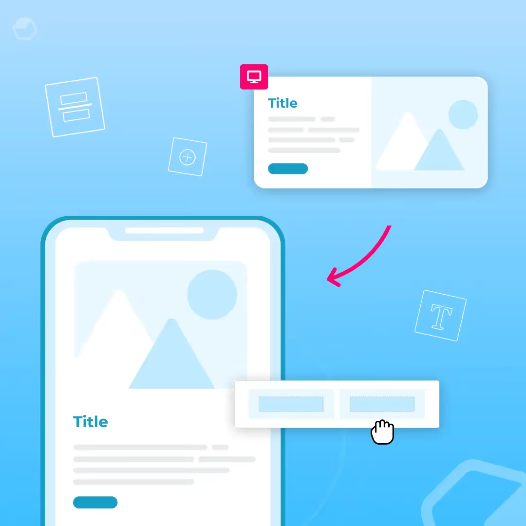
The reign of single column layout is over. It used to be common advice that single-column emails render better on mobile devices. Luckily, responsive design tools are here to save the day. It's true that single-column works best for mobile and that 50% of users check email on mobile devices. But responsive emails show up in the best format no matter which device is used. That means you can design a multi-column email and still be confident that it will render well on both mobile and desktop.
Why is this important? From a graphic design perspective, the single-column email view is pretty boring. Multi-column design takes advantage of F and Z patterns to create a visual hierarchy, rather than creating an endless one-column scroll. From an email marketing perspective, users are 65% more likely to click through if they open your email on a different device. What this means is that emails are opened in different environments by the same user, so you can't just optimize for mobile or just optimize for desktop — you have to optimize for both. That's where multi-column design comes in.
When to use multi-column email layout
The multi-column email layout allows for endless design flexibility and has a number of benefits:
- Get more creative with your designs. Columns, multiple CTAs, bright images — you can use these in single-column, but multiple columns allow for much more creativity.
- More opportunities for CTAs. Buttons, links and images allow for more opportunities to get your audience to act.
- Recurring components. Repetition and patterned elements can come off as repetitive in single-column. When used in multiple columns, it creates an aesthetically pleasing effect.
Here are some examples of when you should use a multi-column email template:
- To display products. Arranging products on a grid allows you to showcase a lot of items quickly, maximizing the amount viewed above the fold.
- For image-driven email with little-to-no text content. If your email is almost entirely image-based, and the images don't require descriptive text, multiple columns might be the optimal layout.
- Multiple calls to action. Having a simple, clear, focused message with a single call-to-action is a wise strategy for busy readers. But if you have more than one call-to-action and no strong hierarchy to your message, multiple columns can be beneficial.
- To link to secondary content. Many publishers send emails with a feature story at the top, followed by secondary content in multiple columns underneath it. This layout can be used to focus readers' attention on the most important piece of content but still provide additional information.
Benefits of multi-column email design
Key insights on why multi-column is a great email design choice:
- Flexible width columns. You can resize and adjust the width of any column you choose, allowing you to add several columns to each of your rows.
- Design for mobile. When you design emails, you want to make sure they render just as well on mobile as on desktop. Check how your designs will render on mobile right in your editor for easy and fast creating.
- Responsive with no code. The diversity of your layout will not require you to code anything, allowing you to focus on the elements for faster production time.
- Proper text alignment. The multi-column design allows for more copy without repetitiveness. Rearrange the copy within multiple columns to avoid repetitiveness for more visually appealing emails.
- Reverse stacking. Rows containing multiple columns will render vertically on mobile. You're able to override this function and also reverse the way in which those columns are stacked to avoid zig-zag looking designs.
Wrap up
When it comes to email design preference, a responsive multi-column email is optimal. This layout has numerous benefits due to its design flexibility.
Articles to wet your whistle




.png)
Subscribe to our newsletter.
Dive into the world of unmatched copywriting mastery, handpicked articles, and insider tips & tricks that elevate your writing game. Subscribe now for your weekly dose of inspiration and expertise.