

How Hot Are These Online Dating Emails? We Looked at OkCupid, Hinge, and The League
Explore the effectiveness of online dating emails from OkCupid, Hinge, and The League. Gain insights into successful email campaigns!


The online dating industry is showing no signs of slowing down. According to a Pew Research Center survey, 15% of U.S. adults have used online dating sites or mobile dating apps, and nearly half of the public knows someone who uses online dating or who has met a spouse or partner this way. So we were curious: what does this industry offer when it comes to email marketing? We looked at a variety of free dating apps and services to see which brands actually sent emails consistently and effectively. Here's what we learned from how three brands are handling online dating emails.
Friendly and approachable: OkCupid's bold, fresh look
OkCupid is a free dating service that's been around since 2004, available online and via apps for iPhone and Android. Its app and website both underwent a redesign for a bold, fresh, quirky, illustration-driven look.
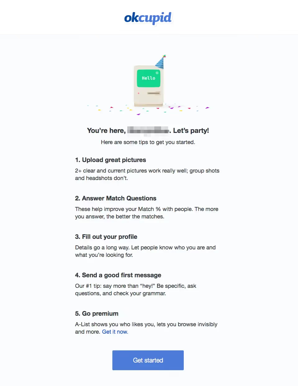
Here's why this design works:
- Simple, branded header. OkCupid skips the clutter of a navigation menu, using its logo as a simple header, which makes it versatile and effective.
- Cheerful hero illustration. The illustration style is playful and fun, and the festive spirit is a good choice for a welcome email.
- Large, legible text. Most of the email is live text, so there are fewer rendering risks, and the copy is short and easy to read.
- Easy-to-spot CTA button. That CTA button passes the squint test, and there's just one, placed adeptly at the end of the email.
OkCupid's match email is also effective:
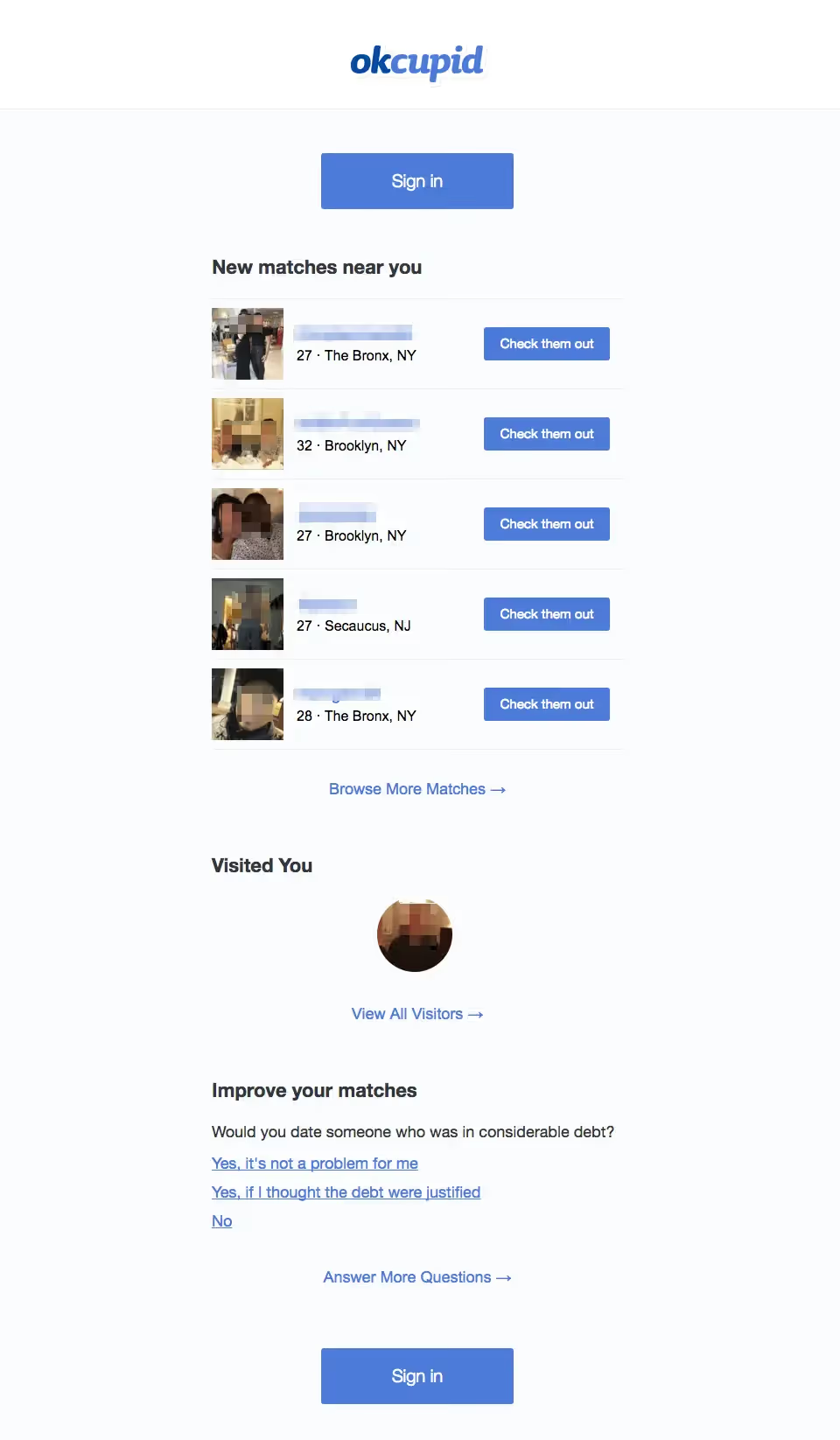
- Personalization. Instead of simply inviting a user to log into the app to check recent matches, the email shows the new matches, along with a CTA button to view each profile.
- Engaging in-email survey. A single-question in-email survey as secondary content makes it easy for readers to respond, increasing engagement.
Intimate and warm: Hinge's relationship-driven makeover
Hinge used to be a dating app driven by swipe technology. It later relaunched as "the dating app for people who are actually seeking relationships," with a new, modern, photo-driven look.
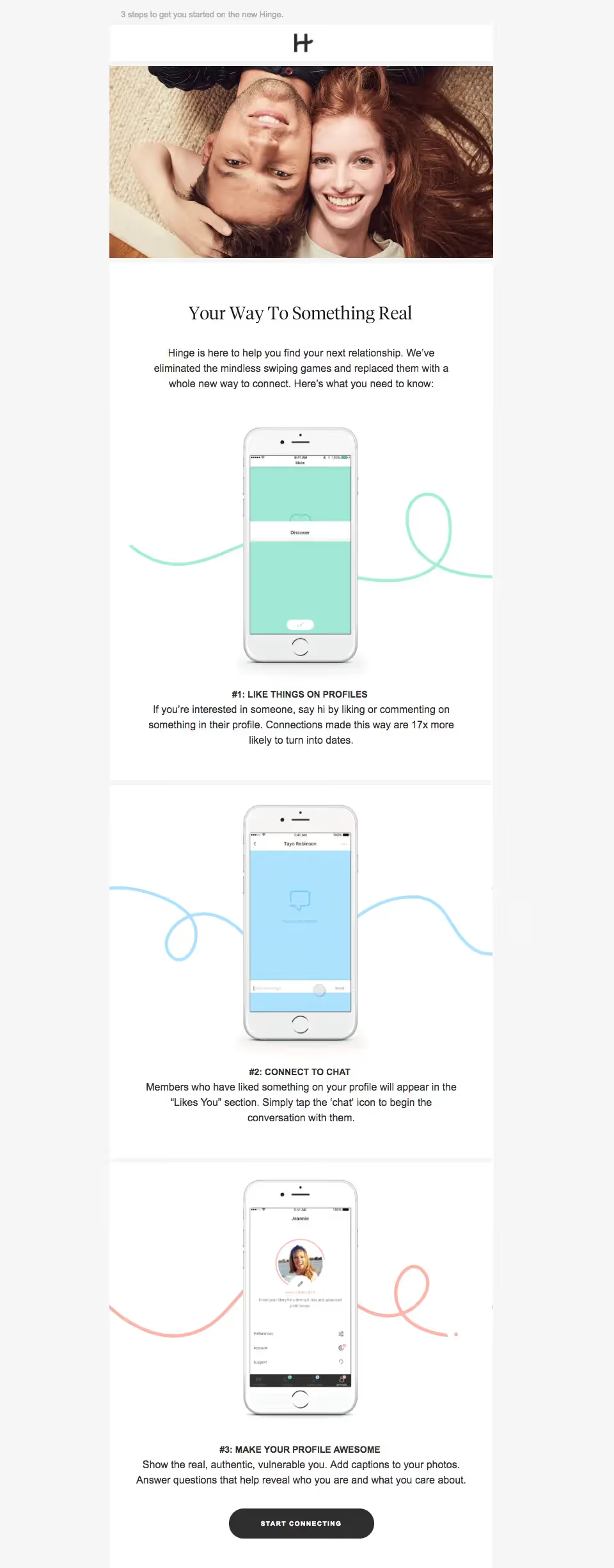
- Single-column module design. Using an inverted-pyramid style for each module, the sections include animated GIFs, headers, and a short snippet of text. Subtle HTML background colors give the modules subtle borders, boosting organization.
- Show-not-tell animated GIFs. The screenshot-style images are animated GIFs, adding a great interactive quality that shows readers how to get going with the app.
Another email from Hinge introduces new content to users:
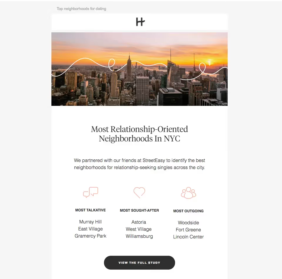
- Customized stock imagery. Hinge takes a basic stock image and adds the brand's signature squiggle through the sky, a smart way to get the most out of a stock image.
- Sweet spot illustrations. Simple, engaging icons add a little something extra to the email that sets it apart.
Modern and creative: The League's organized wordiness
The League dating app is best known for its exclusivity, with a screening process and only a fraction of applicants accepted. Visually, The League leans heavily on a black-and-white color scheme, with a mix of photography and turquoise spot-illustrations, prioritizing text content over visuals.
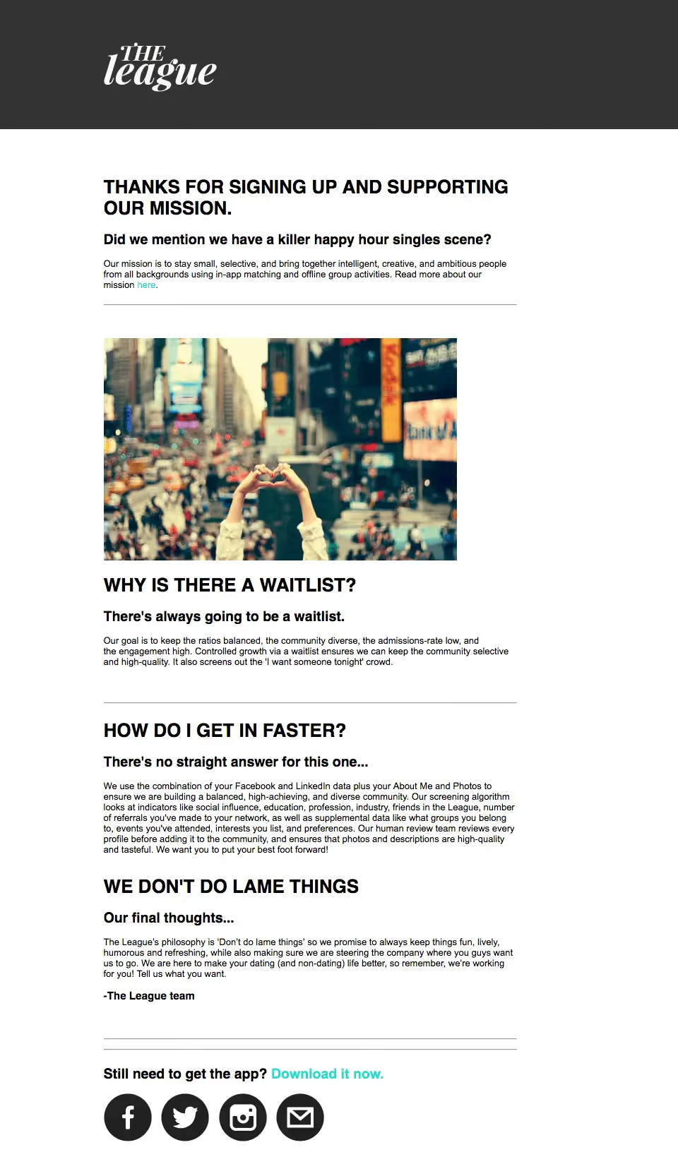
- Text headers. Bold, all-caps headers and bold sub-headers keep the message organized. Ample padding between text blocks and horizontal lines help, too, keeping a text-heavy email skimmable.
- Customized linked text. Linked text in the brand's teal color, rather than default underlined blue copy, ties the design together.
A follow-up update email from The League stands out for a different reason:
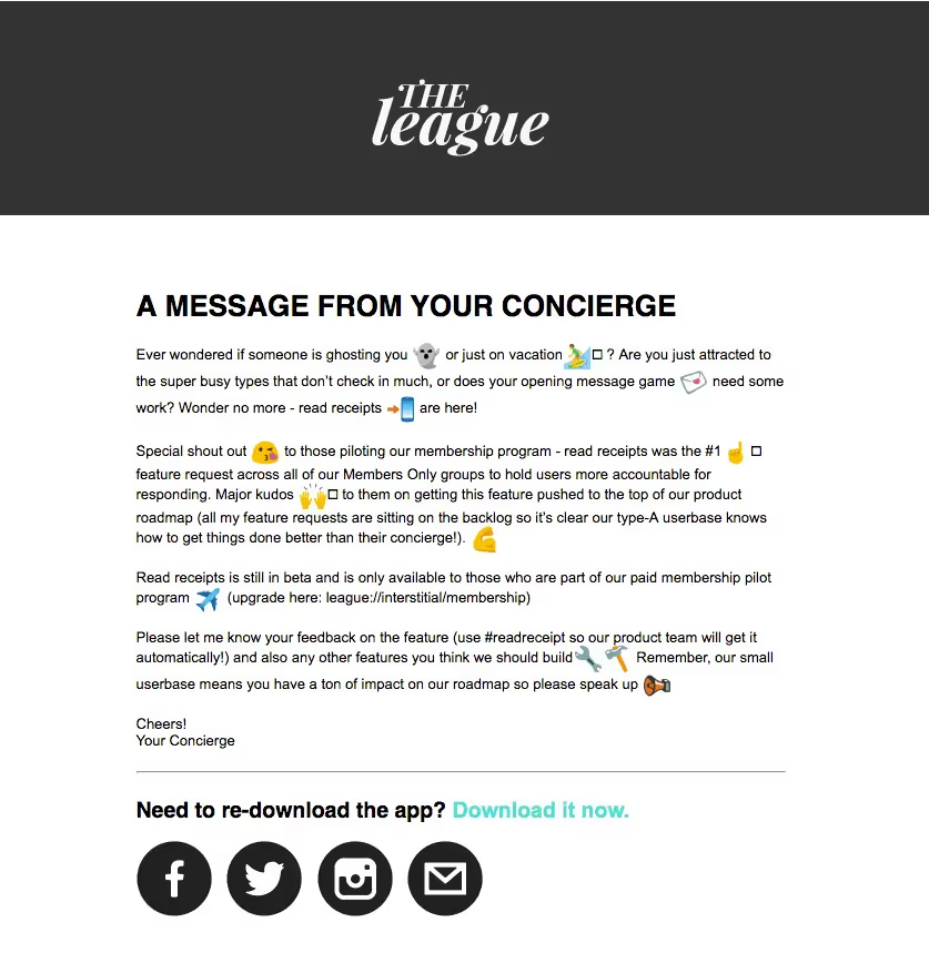
- Creative emoji. What makes this email stand out is its creative use of emoji in the body of the email rather than just the subject line — a cute approach likely to catch readers' eyes.
Wrap-up: The design tips online dating emails have to offer
- Simple, versatile, branded headers are winners.
- The more data, the better. Engage readers with an in-email survey.
- Animation helps show users how your product works.
- Whenever possible, be personal. Customize emails for users to engage them better.
- If you're going to use a lot of text, organize it! Be smart about headers and dividers.
Articles to wet your whistle


.png)
Subscribe to our newsletter.
Dive into the world of unmatched copywriting mastery, handpicked articles, and insider tips & tricks that elevate your writing game. Subscribe now for your weekly dose of inspiration and expertise.